Inequality Tracked Through Six Decades of Graphs
Research and writing for Fifty Year Perspective is devoted to preparing for the future by understanding lessons from the past. An overriding objective in seven-plus years of writing has been sustainability: What trends, if allowed to proceed unchecked, would produce disastrous results, either physically – such as making regions of the earth uninhabitable – or socially – such as causing political upheaval or civil war?
The graphs that follow point to potentially dangerous trends. They capture shifts in the United States economy and society that explain much of the anguish building in a large share of the population.
Inequality is a central social issue today, not unlike the Gilded Age of the late 19th century. Early decades of the 20th century brought reforms, but it wasn’t until after World War II that prosperity raised living standards for a majority of the population in the U.S. The 1970s brought a reversal of the economic gains for middle and lower class families. Figure 1 displays the shares of national income received by the top 1% of households and the bottom 50%.
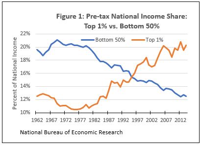
In 1969 the bottom 50% of households received 21.1% of income and the top 1% received 11.4%. By 2014 relative positions had switched: the bottom 50% received 12.5% of income and the top 1% received 20.3%.
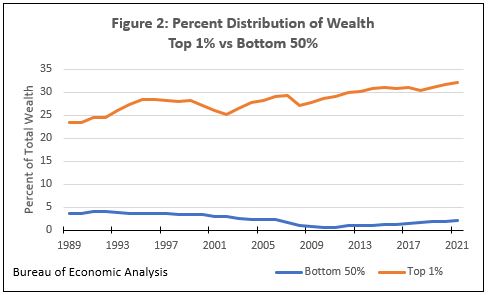
Household wealth is a better measure for determining ability to cover unforeseen expenses or afford amenities. Figure 2 displays the gap between the income groups in Figure 1. The bottom 50% of households owned no more than 4.1% of the nation’s household wealth over the last 32 years. The top 1% of households enjoyed an increasing share during that period, increasing from 23.5% to 32.1%, with slight dips during recessions in 2002 and 2008.
A standard measure of inequality in household income is the Gini coefficient. Lower Gini coefficients indicate relative income equality; higher Gini coefficients indicate relative income inequality.
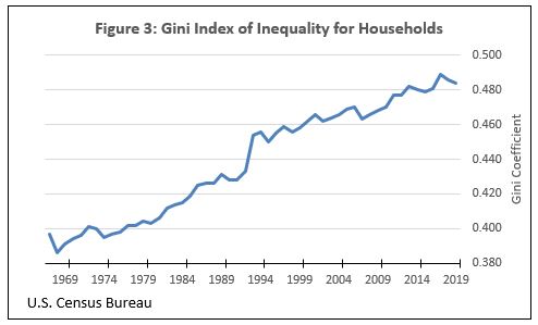
Figure 3 displays the trend for U.S. households from 1967 to 2019. Household income inequality increased by 22% during that 52-year period. In a summary of inequality of 140 countries in 2017, 83 countries had less inequality than the U.S.
Figure 4 shows that while worker pay was nearly stagnant (when adjusted for inflation), productivity increased.
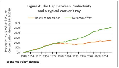
From 1948 to 1975, worker pay increased by nearly 100% and productivity increased over 90%. By 2019 worker pay had barely increased beyond the 1975 level. But productivity had increased by almost 260% since 1948, double the rate of increase for workers’ pay.
How did pay and productivity diverge? Figures 5 and 6 provide some answers. Generally the benefits of productivity have gone less to the workers and more to corporate executives and shareholders.
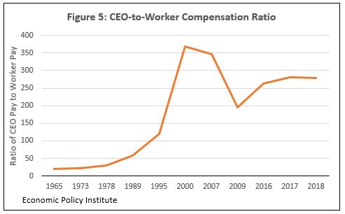
An often-raised complaint is that CEO pay has wildly outpaced worker pay. In 1965 CEO compensation was 19.9 times that of the average worker. By 2018 that ratio had increased to 278.1 times worker pay. Figure 5 shows dips occurring during the 2001 recession and the Great Recession of 2007.
Another factor in falling worker pay is the decline in the percent of workers belonging to unions, as illustrated in Figure 6.
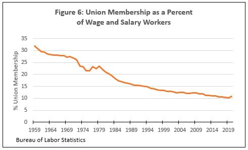
Union membership peaked in the U.S. in the 1950s at over 30% of wage and salary workers. By 2019 it had fallen to 10.8%, denying workers representation in contract negotiations. In August 1981, President Ronald Reagan set a precedent by firing 11,359 air traffic controllers, members of the PATCO union, who had gone on strike. Use of strikes as a negotiating tool declined after President’s Regan’s intervention.
This is Part 1 of 2 posts about shifts in the U.S. economy and society. Part 2 will continue in the next post from Fifty Year Perspective.