Demography As Destiny
There are few predictions that can be made with as much certainty as this: People born in 1950 will be 65 years old in 2015. Combined with life expectancy trends, the implications are enormous for housing, education, medical care, employment, and more. Thus, demography is a powerful planning tool for both businesses and governments.
Population age pyramids graphically represent the age structure of a population at a single point in time. The first example below depicts the population of Europe in 1960. The pyramid is broken into 5 year age cohorts. The population ages 0-4 in 1960 is the bottom bar, ages 5-9 in the second bar, and so on. The left sides of each bar represent the number of females in each age group, and the right sides represent males.
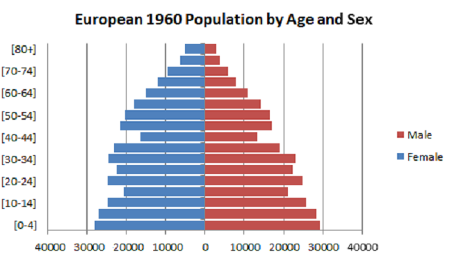
Important periods in Europe’s history are revealed by the varying sizes of its 1960 age cohorts. Population ages 40-44, who were born between 1915 and 1919, comprise a much small cohort than those above and below it. Those years involved the child-bearing population in the First World War. Births again increased in the 1920s, then decreased during the early 1930s years of the Depression. Births again decreased during the Second World War. The pyramid’s bottom three cohorts represent Europe’s post-war baby boom, beginning with births in 1945-49, 1950-54, and 1955-59.
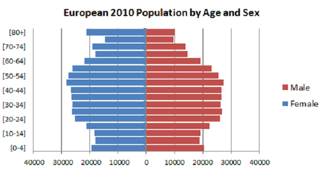
Fast forward 50 years to the population pyramid for Europe in 2010. One’s first reaction is that this looks decidedly un-pyramid like. The three population cohorts that formed the base of the 1960 pyramid were, in 2010, ages 50-54, 55-59, and 60-64. People born in 1960-64 and ages 45-49 made up a larger cohort than the previous three cohorts. But following them, cohort sizes were fairly stable for 25 years, before decreasing again in the 1990s. Meanwhile, the oldest age cohorts in 2010 were much larger than they were in 1960. In 2010 there were more than twice as many people ages 65 and over than there were in 1960. As a percentage of the total population, people ages 65 and over went from 8.8% of the population in 1960 to 16.3% in 2010. Over the same time span, the population ages 0-19 decreased by 23%, so fewer young workers will be entering the labor force as the retired population continues to grow.
The third population pyramid depicts the population of Eastern Africa in 2010. It looks more like Europe in 1960, with age cohorts increasing in size for each younger cohort. The pyramid reveals a population with a much shorter life expectancy than Europe in either 1960 or 2010. And while the annual number of births has been relatively constant, the decreasing cohort sizes indicate a high child mortality rate, in fact, one that is over ten times that of Europe, according to UN statistics.
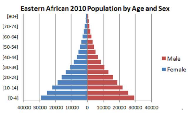
The issues facing these two regions couldn’t be more different. Eastern Africa needs improvements in health care, education, and environment; Europe needs services for elderly. Europe faces a shrinking labor force and needs workers; Eastern Africa needs employment opportunities for a large working age population. Eastern Africa needs infrastructure investment – roads, water, energy, sanitation, and good governance. But both need foreign direct investment, increased international trade, adoption of new technologies, and economic growth that benefits all their populations.